
Consumer Goods Site Overhaul
The Rundown.
The Ask.
Ocean Spray found that most customers who visited their site were spending very little time on it. They were often entering to an interior page via Google and leaving. The company wanted to bring more attention to it’s health blog and the fact that it is owned exclusively by farmers. They looked to my team to bring their site into the modern era and raise the visibility of this information.
The Objectives.
(1) Increase time spent on the site per visit
(2) Give users reasons to discover more across the Oceanspray.com site
(3) Make it easyy to discover new content
(4) Accomplish the above in a limited set of reusable templates
My Role.
As the UX architect, I was responsible for the information architecture and testing of the site.
Toolkit.
Mapping and wireframe creation
Usability Testing
Design QA
Information Architecture.
We started by accounting for all of the page/content types in the current experience. We took what we found and constructed a sitemap.

Site Environments.
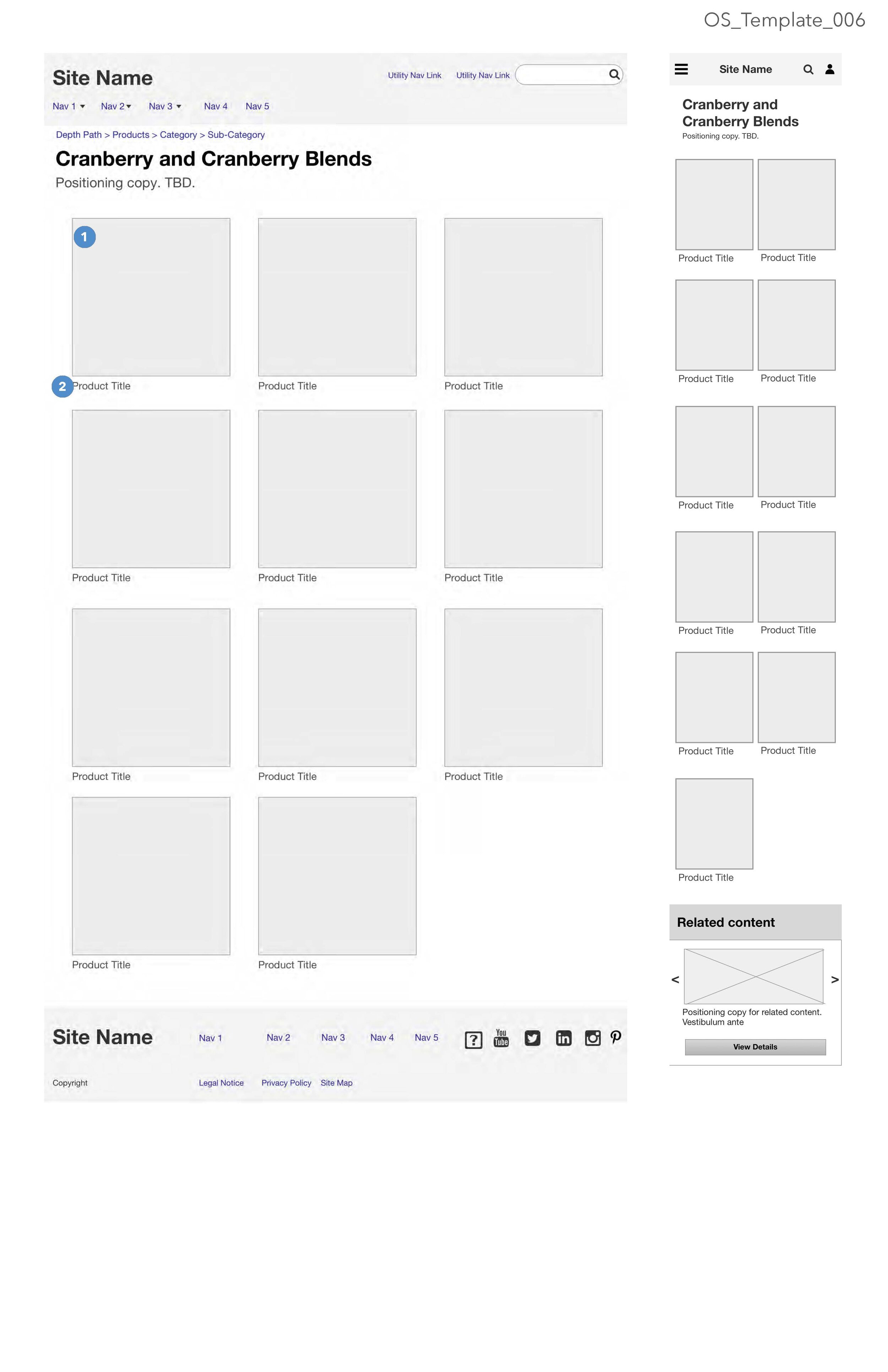
Recipes and Products
Customers were already coming to these pages primarily. This was the where we wanted to start providing alternative mechanisms for discovery. We hypothesized that we could do so by adding a random product generator and a theme-based recipe recommender. Additionally the interior detail pages would cross-promote other relevant, Ocean Spray content.


Health, Blog & Cranberry Club
Few people knew that Ocean Spray was family owned. Even fewer knew that the Co-op offered content about cranberry health. Prior to our exercises, the content lived on other Ocean Spray sites. our work consolidated the content of all of those sites under a single URL.


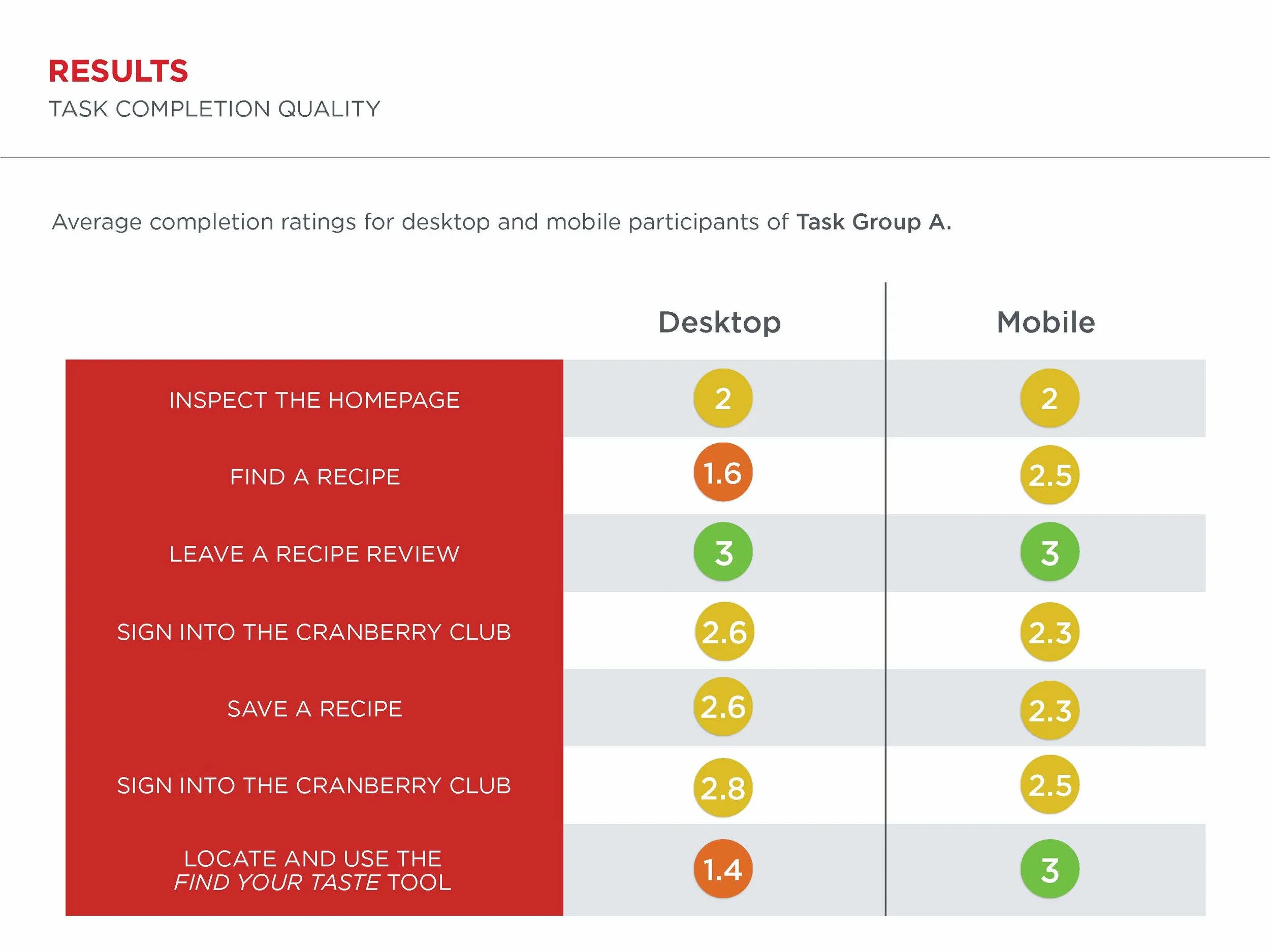
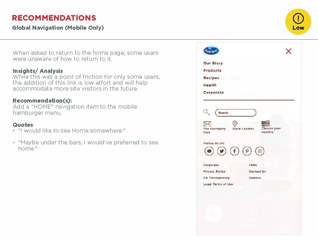
Usability Testing
The home stretch. After developing a set of templates, we administered usability tests with a set of screened participants.


Before

After
Check it out at Oceanspray.com