
Enterprise Order Tracking
The rundown.
The Ask.
(1) Deliver a micro-services frontend that could be used by AT&T employees to more efficiently track customer orders.
(2) Translate the data & interaction patterns from this blue sky initiative to an existing tool used by another community.
Objectives.
(1) Stand-up a single destination for users seeking order-related information.
(2) Make the interactions simple, regardless of how complicated the data is.
(3) Understand what users want/need to do their jobs in the first place. Make those findings the cornerstone of the experience.
My Role.
I served as the design lead and a UX team of one. I was responsible for the strategy, definition of experience goals and execution of the engagement.
Design Toolkit.
1. Generative Research
2. Customer Journey Mapping
3. Wireframes and Final, Visual Design
4. Usability Testing
5. Implementation and Design QA
Plan of attack
Over the course of the project we would have to:
Understand users’ goals, and define the use cases.
Craft, validate and implement a design system flexible enough to accommodate all identified use cases.
Translate the interactive patterns we developed to the secure platform (in progress)
Defining user goals and identifying use cases
I started with user interviews to understand what a day in the life of the employees looked like. These sessions allowed me to create high level user flows and validate/invalidate information I inherited about the first set of personas. Users not only gave clarity into their day-to-day exercises, they were also willing to show off the tools and tricks that they used to make their work life easier.
Our MVP was to allow users to find orders and build lists. Fortunately, this was a useful feature and a fairly common daily activity in the community.


Designing and Validating an Appropriate Design System
With a firm idea of what users had to accomplish in mind I began giving shape to the experience. Order health and order lookup were key to the different personas.
I continued to review regularly with the user community. I also had small review sessions with development to ensure the technical feasibility of the designs.
Initial Concepts & Wireframes


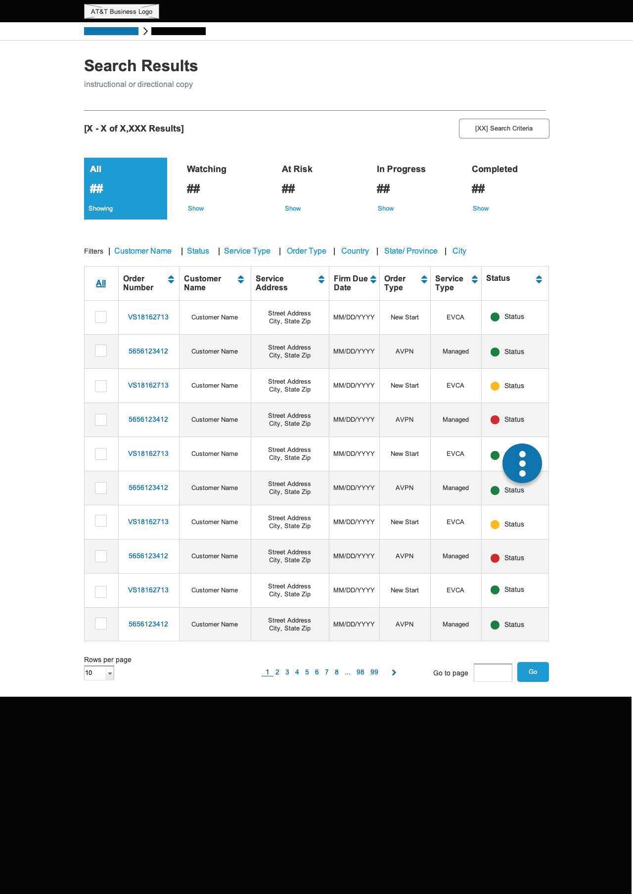
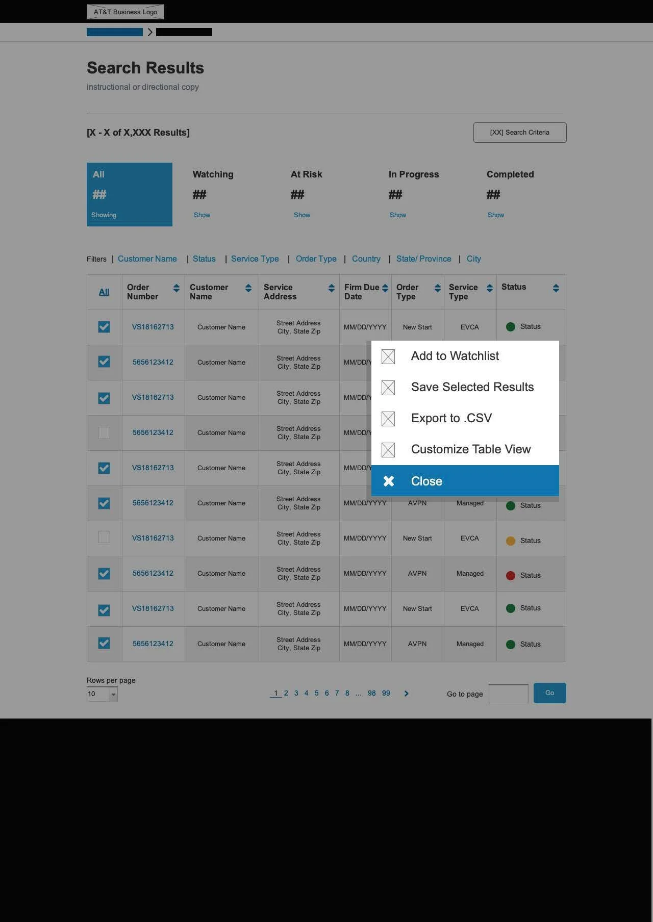
Mark II: Medium Fidelity


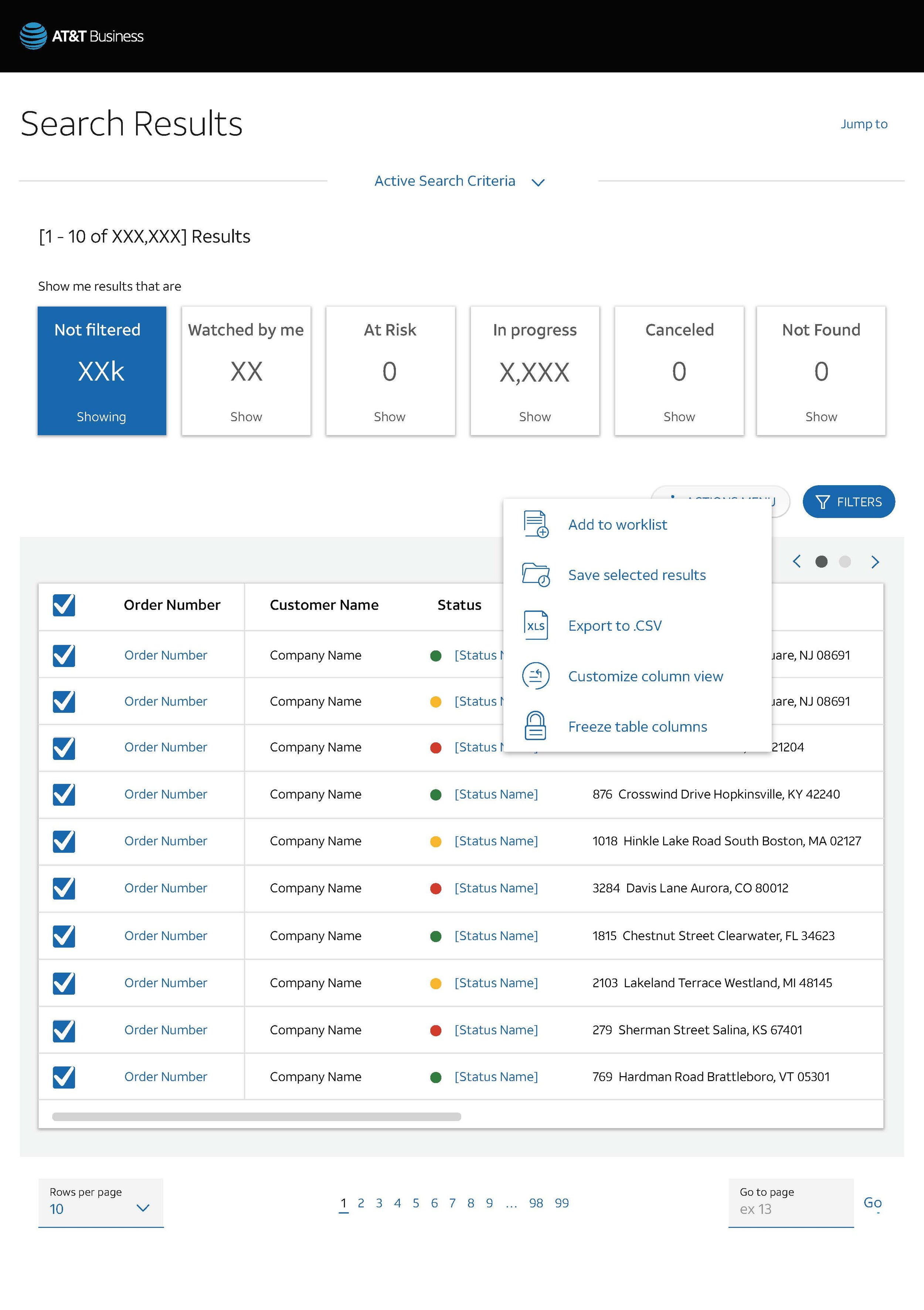
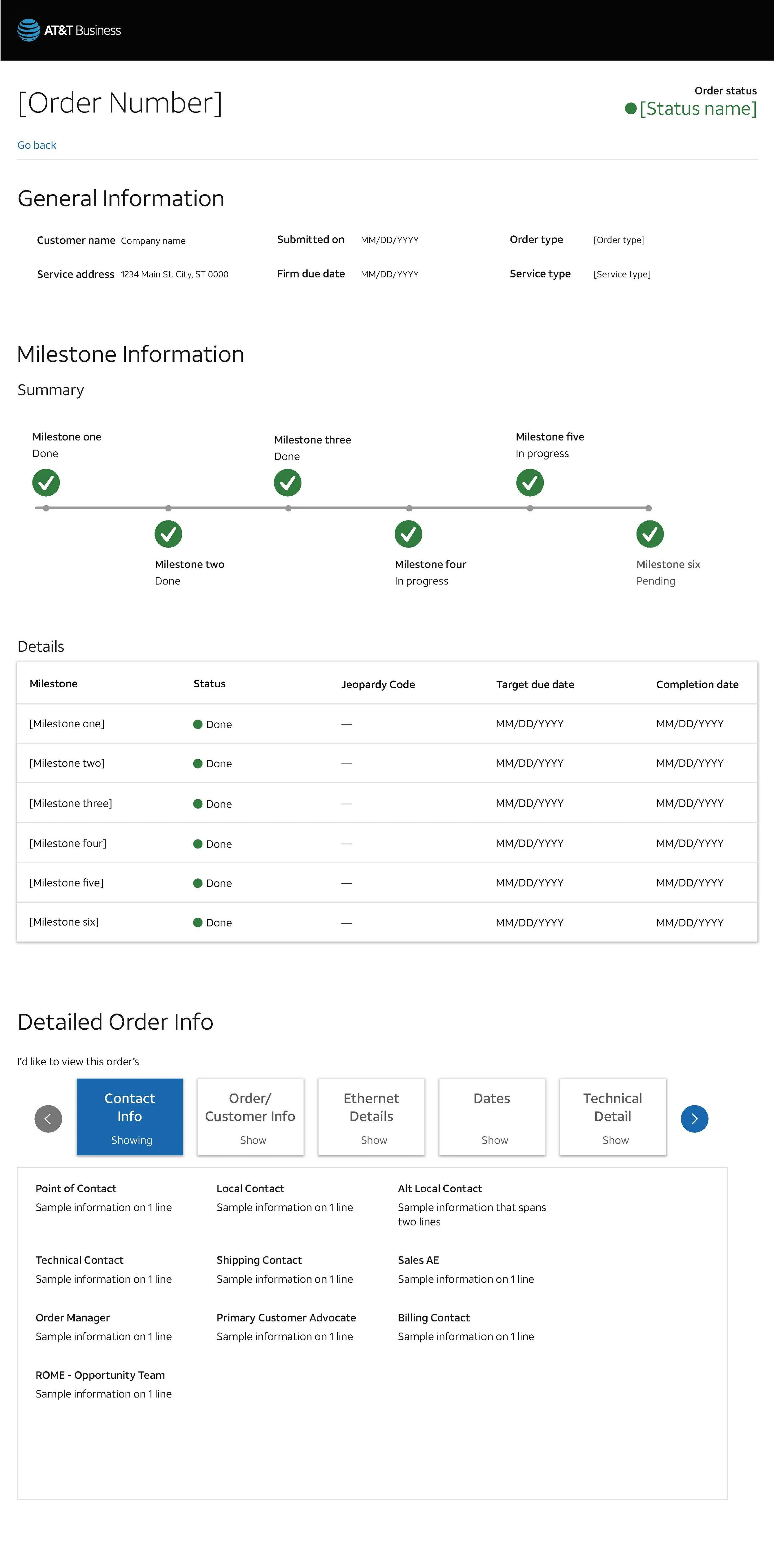
Mark III: Final Version (Responsive, User Tested & Developed)


For the design to meet our experience goals, the components would have to be reusable in other experiences. Additionally, the interface would need to be equally in effective from via desktop and mobile devices (for associates who worked in the field. Responsive design had not been an explicit objective of the project team, but I worked with a great developer to build a flexible set of components.
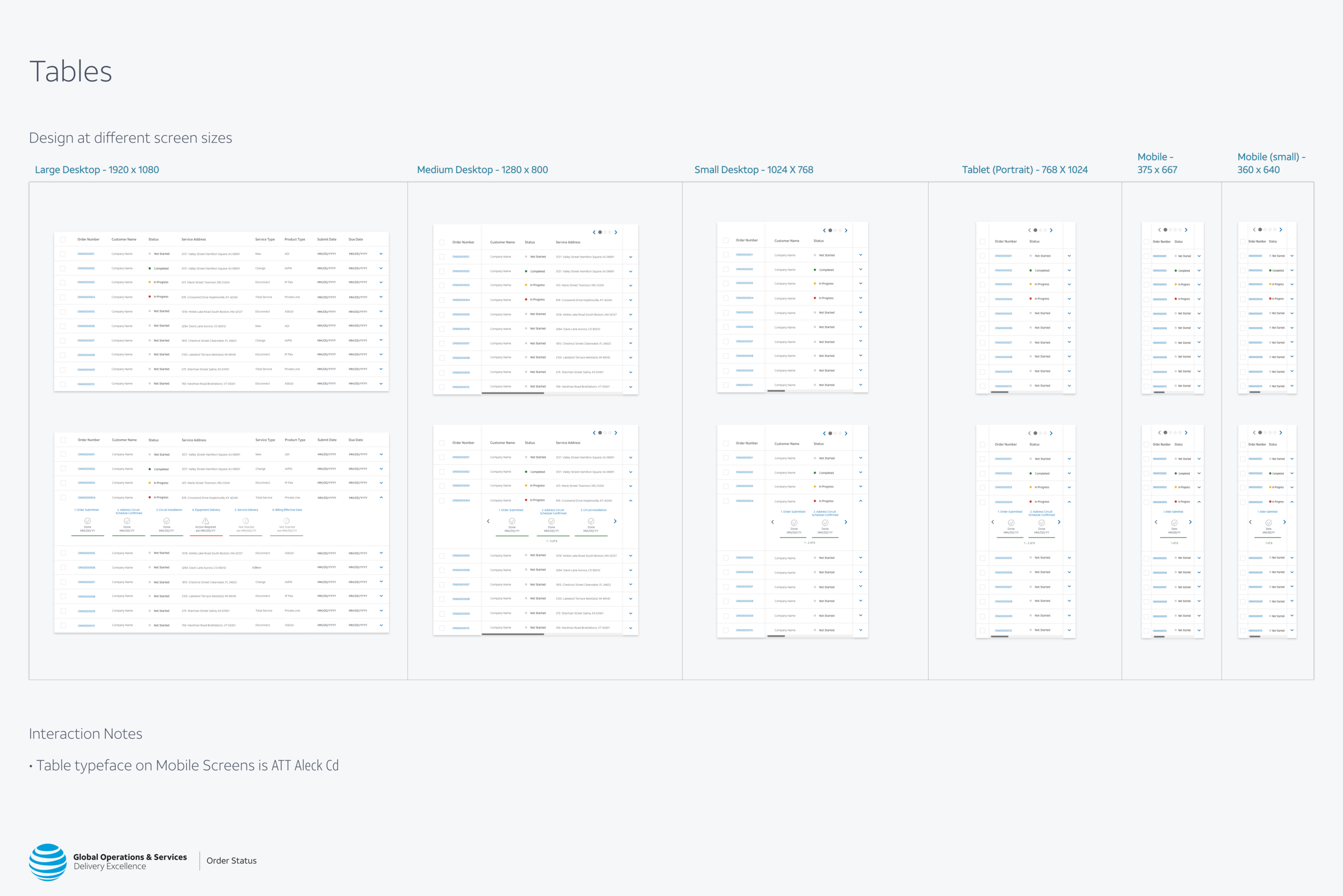
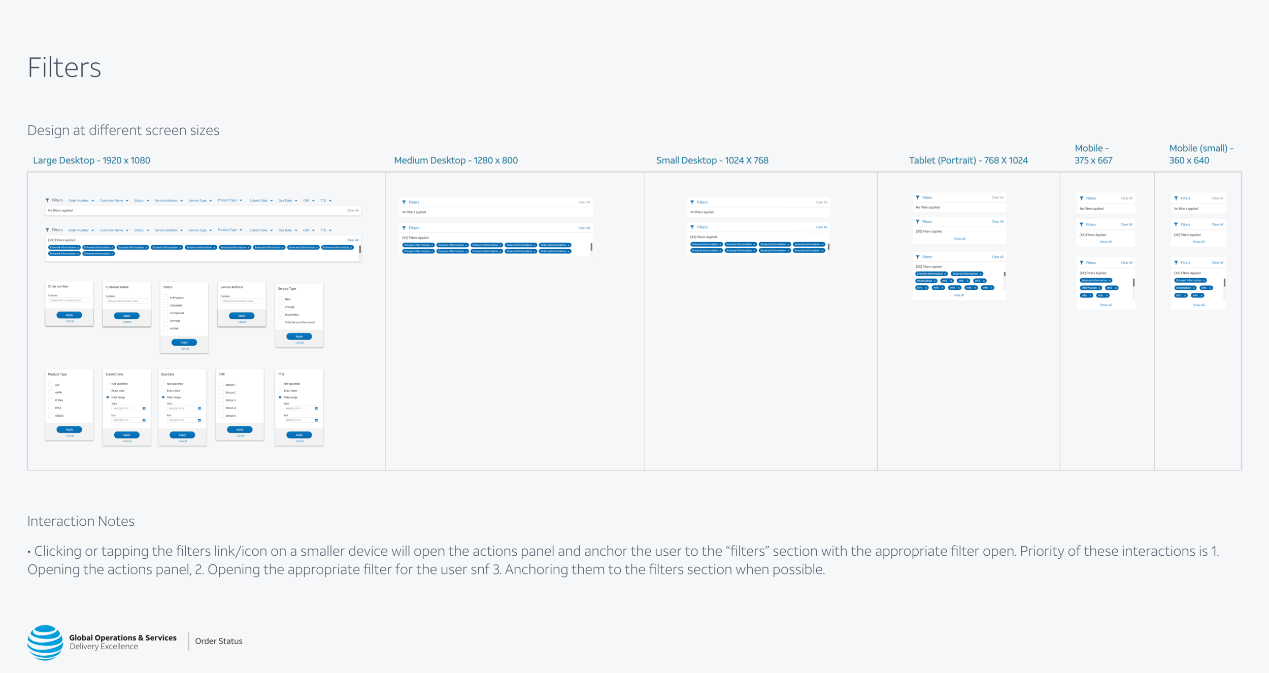


Feedback from Usability Testing
“My first reaction is that I like the interface overall. It’s very exciting to see/have a multitude of products being listed in one spot and anything that is attached to my ID available to me.”
“I like that this shows me my orders. I think that this would save a lot of time in the order status process.*”
“The system itself is super exciting. Nothing in here is too difficult- everything is learnable.*”
“Right off the bat, just looking at it it does look like a very clean and concise page. I like that because some of the tools are very busy on the home page. So I do like that everything seems more organized, clear and concise.*”
Translation (Current Stage)
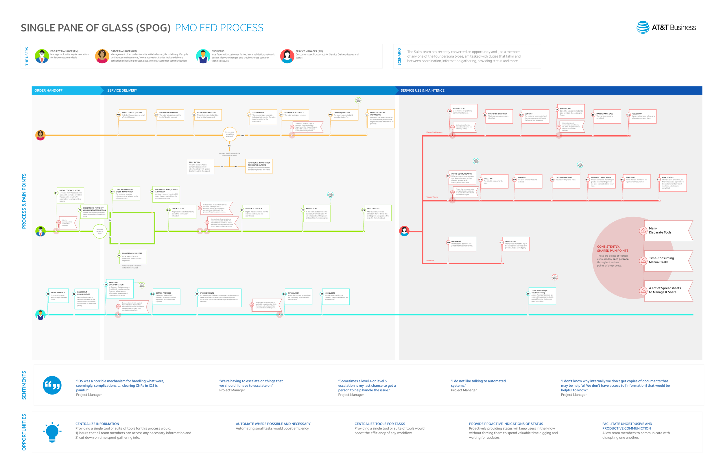
Translation began similar to the first steps of this engagement. The new audience requires much more than the Order Search functionality. I started by understanding how the teams work (individually and together). I’m currently testing and implementing designs on their internal platform.
Next Steps
The new exercise accounts for more data and more use cases. Regardless, I’m continuing to to co-create and iterate with users and development.

